| Contact Us |
|
|
|
2017: Simplifying a Lengthy Wordmark by Creating a VFF logo...
The lengthy wordmark for The Vintage Film Festival (Canada) was hard to use on many current promotion materials. The new VFF logo (acronym) we designed solved the problem, to great success. 2017 was their 25th, silver, anniversary. So we also designed a 25 years logo to fit with the new logo. The festival is held in the Port Hope, Cobourg area... |
|
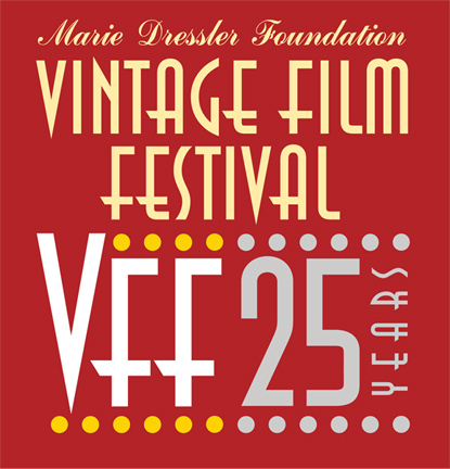
The dots are evocative of the old (vintage) movie theatre marquee lights. The new logo lettering is based on the former identity typeface but was then "hand lettered" to work as a "simple" well remembered logo. |