| Contact Us |
|
|
|
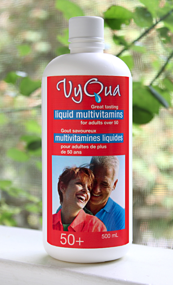
Liquid Multivitamins (late 1980s)
Packaging and identity for the 50 plus market. The client loved that we made the stroke on the "Q" in his product name a drop to visually emphasize "liquid" in the logo :) At the time his research had shown older people preferred taking liquid to taking pills. |
|
|