| Contact Us |
|
|
|
Early 2000s An ID Manual to Help Facilitate the Rebranding & Consolidation of the Businesses of a Family
Panagas owned many businesses. These businesses often worked together on design-build projects mainly in retail. Each business had a different name. Each of the businesses had logos that looked unrelated to each other because they had been designed using quite different design styles. As a first step we redrew the logos of the many businesses so they related visually and directly to the Panigas logo giving more clarity to the overall messaging. This helped Panagas Group grow their sales. |
|
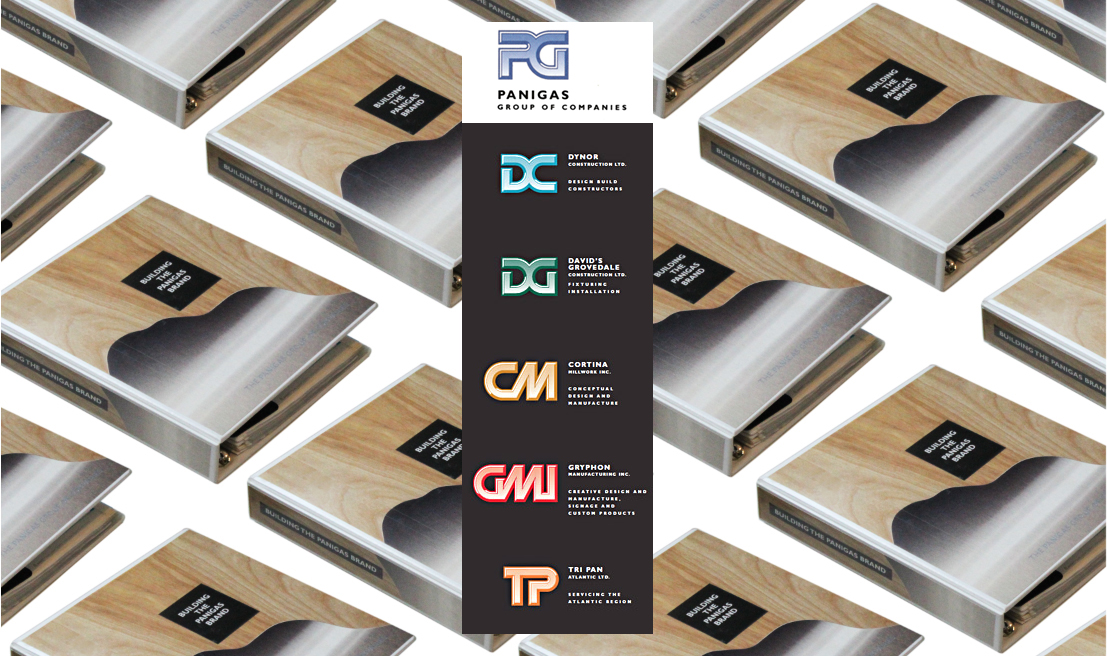
The cover of this manual is a photo of the large wall in the reception of the Panagas head office. It was wood and stainless steel. Panagas had exceptionally skilled trades-people. |