| Contact Us |
|
|
|
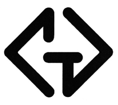
Early 1970s Another Modernist Logo (with a Twist)
The Casselberry Group (CG), a personnel agency, was another new organization wanting to look "modern". We rounded the lines to make it warmer and more friendly. The owner asked for a symbol and collateral reflecting directing arrows. We played on this visual theme throughout all his materials. |
|
|